
Client: Student Project
Challenge: To create and brand a fictional restaurant and design everything from logos to collateral and a full branding style guide.
Solution: For this project I decided to brand a donut shop that particularly targeting an audience who is celiac or gluten-intolerant. I wanted to combine an illustrated mascot that felt retro with clean and inviting typography.
Detective Donut Branding

Visual Research

My visual research process started when I had a gluten free donut at Stan’s Donut shop in Chicago, Illinois. It was my first donut in years and it immediately sparked ideas! I also looked to vintage illustration styles for inspiration on how I wanted my own mascot to look.

Initial Sketches & Ideation

My initial sketches for detective donut revolved around the mascot itself. I pulled inspirations from rubber hose animation styles and other vintage illustrations to create detective donut. I wanted the pose to be dynamic and fun, as well as alluding to the detective side of the mascot, so I decided to include a magnifying glass. The color palette was directly influenced by my own personal favorite donut flavor, which is blueberry.
This section includes the basic overall brand information, which includes various logotypes, color palette, typographic information, and more!
Identity Package
Vertical Lockup
Horizontal Lockup
Logomark

Color Palette


Typefaces

Collateral & Mockups!


Business Card

Menu
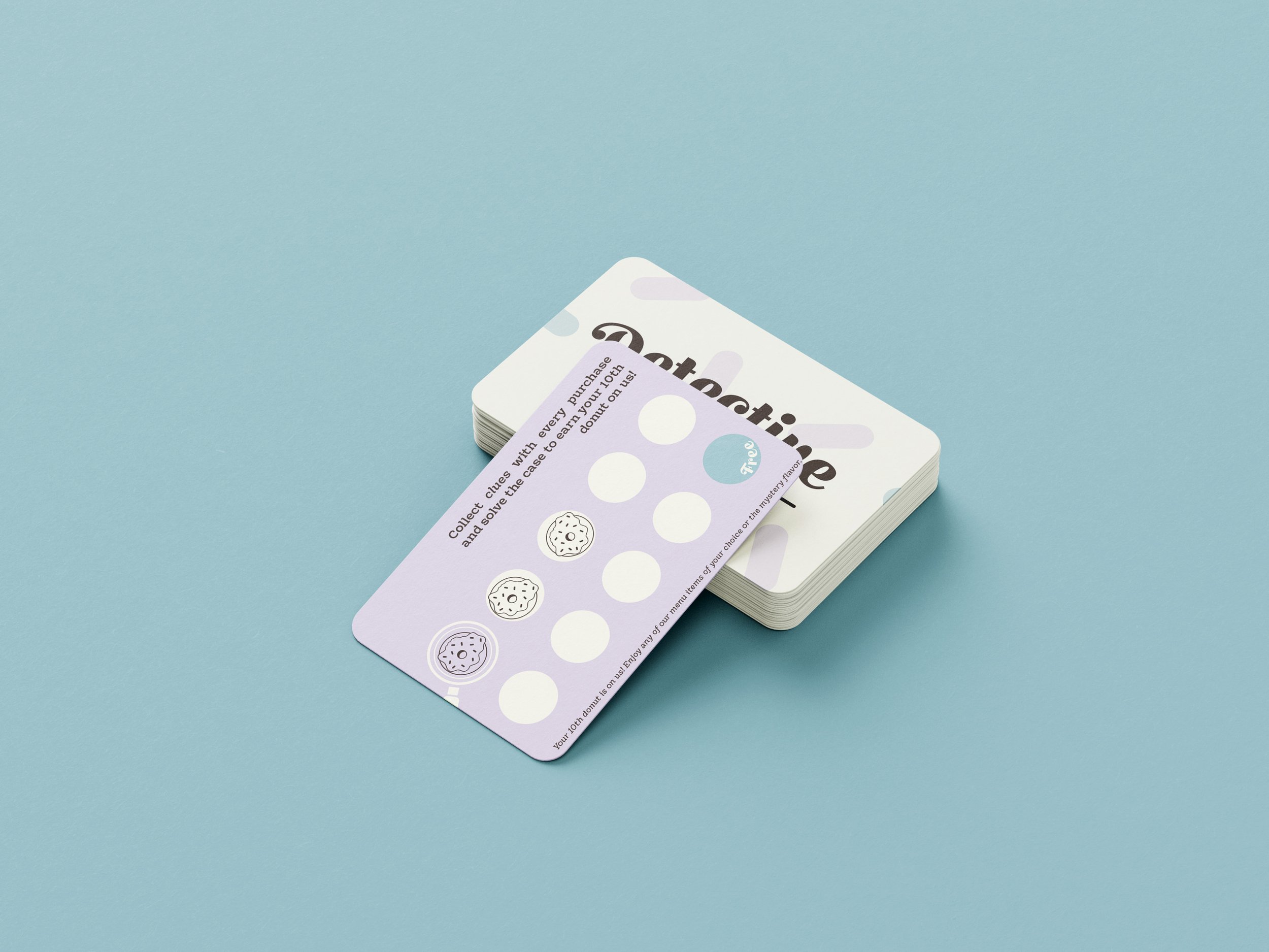
Loyalty Card
Instagram Ad


T-Shirt

Apron
Donut Box

Cup with Sleeve
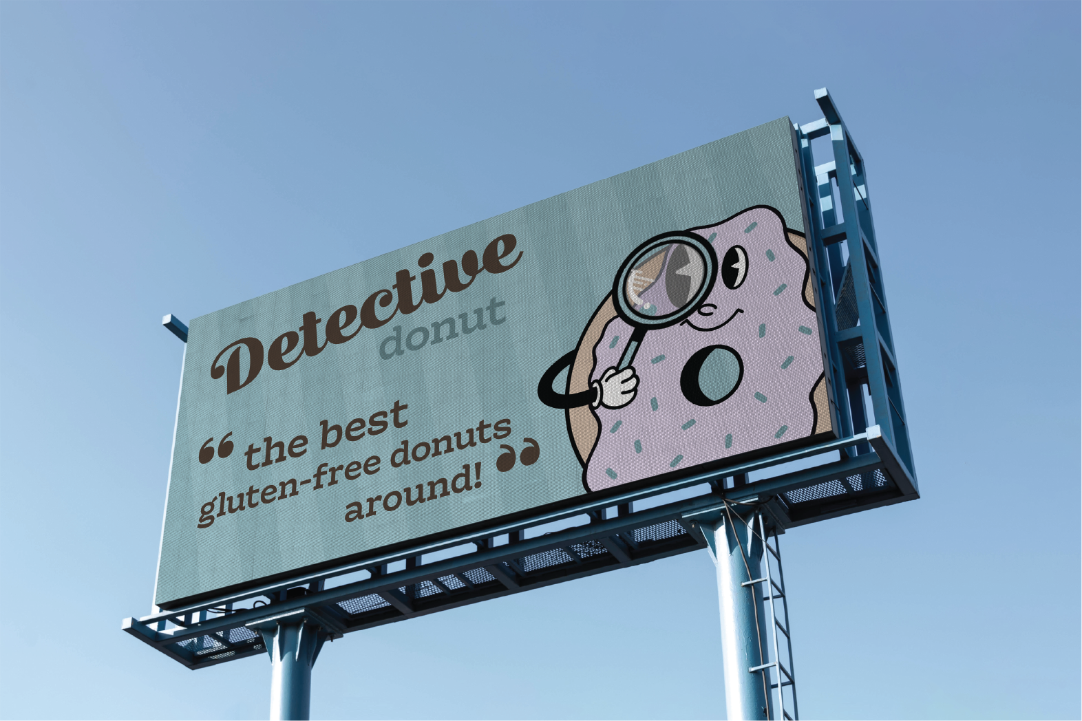
Billboard
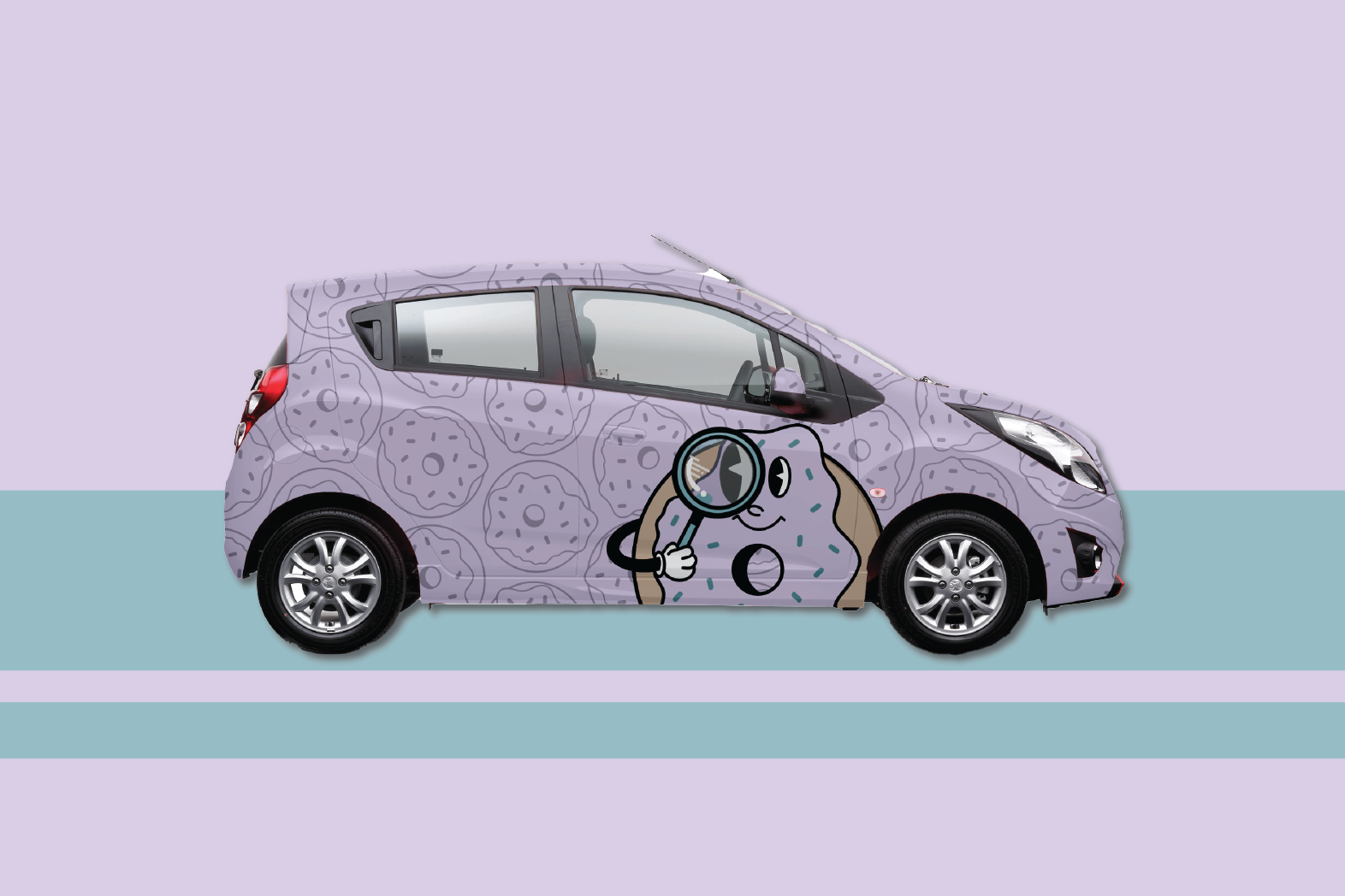
Delivery Car
Branding Style Guide
At the end of the project, when we had all of our key components together, it was put into a style guide format. In this style guide, we explained basic rules and how to correctly use the branding materials, including the logo and typography.
Style Guide Highlights
Clear Space Guidelines

Logo Do’s & Don’ts

Mission Statement

Supporting Language
Final Thoughts
Overall, I had a lot of fun with this project and I was successful in what I was trying to achieve. I was especially successful in creating a brand that felt cohesive as a whole. I believe I chose appropriate typography and imagery that reflected the vibe of Detective Donut. I also learned a lot about what goes into a branding style guide, and I found that I thoroughly enjoyed this process. I had a lot of fun with the style guide and I feel like that can be seen in it’s playfulness as well as it’s cohesiveness.